Things made by

-
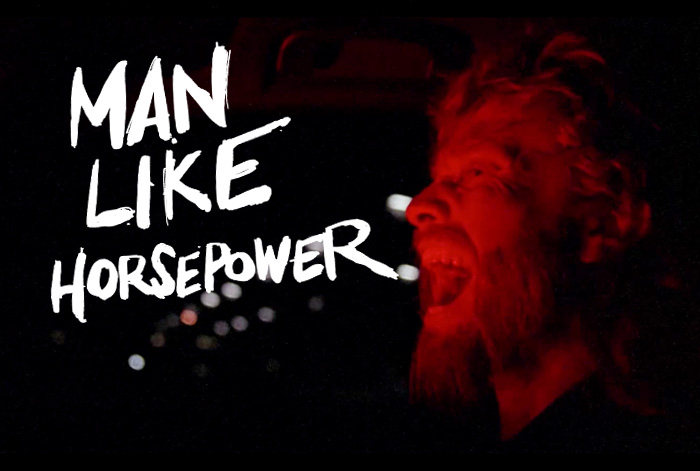
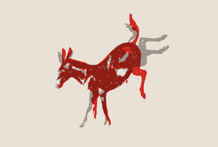
MAN LIKE HORSEPOWER
Valvoline
MAN LIKE HORSEPOWER
Valvoline’s Synpower was launched amongst skeptical enthusiasts who tend to think Valvoline equals old engines, old blokes and older oils. We apppealed to these car enthusiasts’ (somewhat primal) love of horsepower, using a tone that is 100% emotive. Man Like Horsepower – Valvoline gives you the kind of power that you instinctively crave. Put behind the wheel of a high powered engine you’ll go back to your primal self.
INTEGRATED CAMPAIGN | DESIGN DIRECTION
-
global brand identity
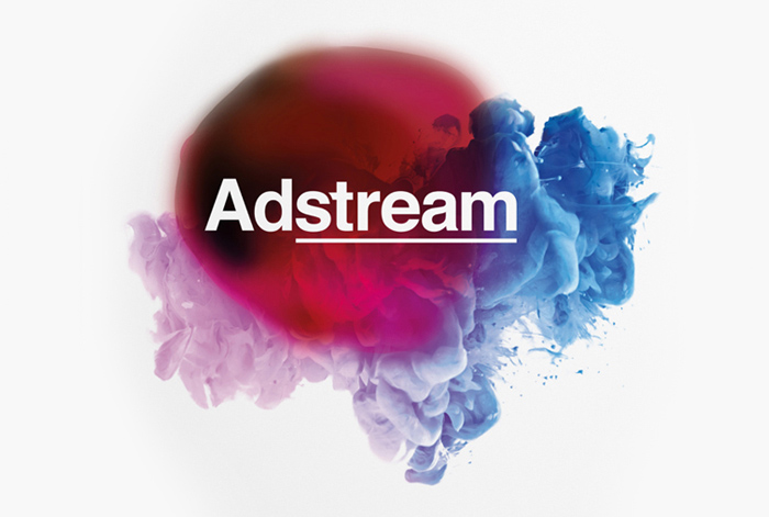
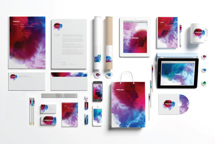
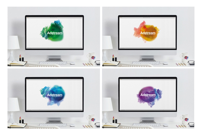
Adstream
ADSTREAM
Adstream is a multi-faceted technology solutions company, with an ambition to revolutionise the way advertising and communication assets are delivered, stored and managed. They needed to reflect this dynamic vision, in a market that perceived them as a simple dispatch service. We created a new brand identity to reflect a business at the ever-changing forefront of communication assets management. Delivering services fluidly, seamlessly, responsively and efficiently. We didn’t create a logo, but a flowgo: a brand identity that constantly flows and evolves. Its organic and fluid feel emphasises streamlining and the ever-changing nature of Adstream’s business as its position as ‘the world’s leading advertising workflow and distribution company’.
GLOBAL BRAND IDENTITY | DESIGN DIRECTION
-
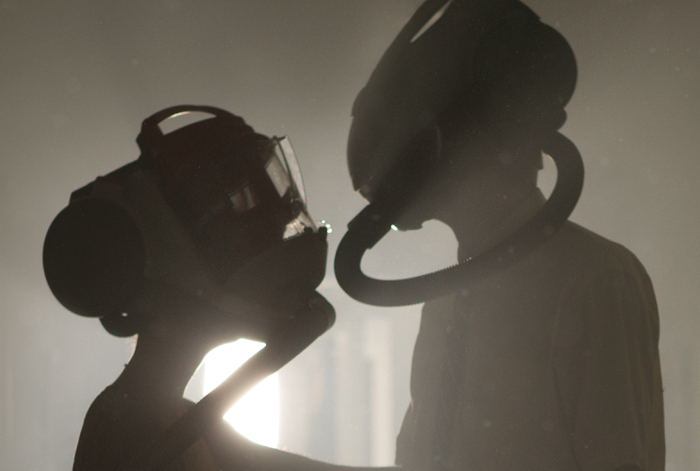
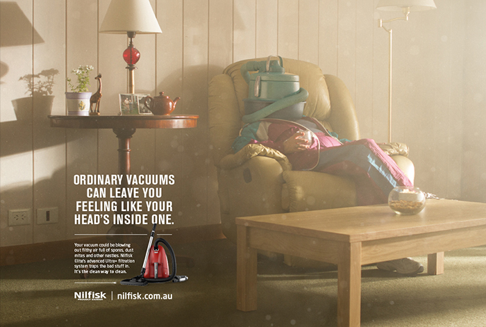
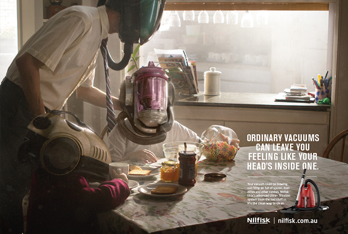
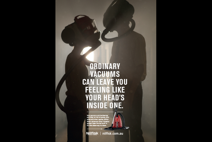
THE CLEANER WAY TO CLEAN
Nilfisk
THE CLEANER WAY TO CLEAN
Most people are not aware that their vacuum could be blowing out unfiltered and harmful air. In this campaign we introduce the vacuumheads to highlight how bad this problem can be. They struggle to go about their daily business. It takes a Nilfisk Elite Vacuum to remedy the situation and allow everyone to breathe easy.
TV/PRESS/POS | DESIGN DIRECTION
-
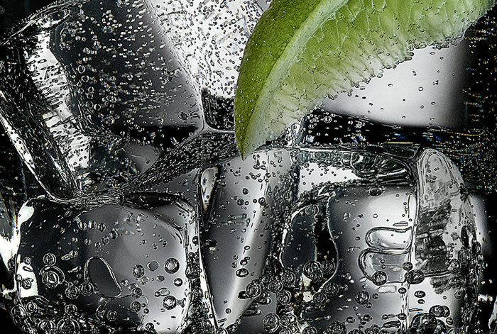
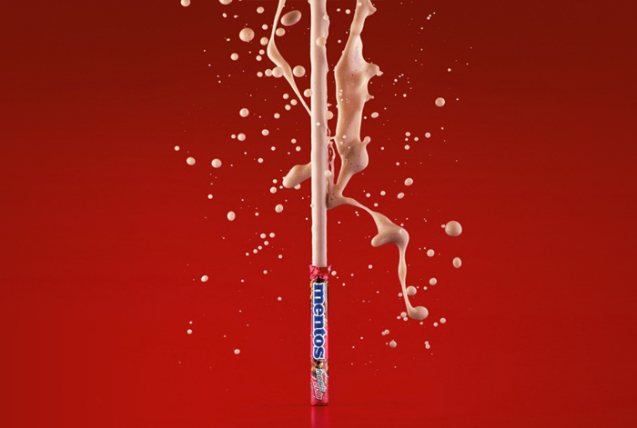
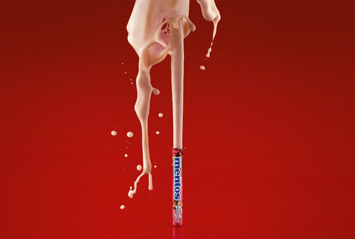
COLA FLAVOUR LAUNCH
Mentos
-
Membership
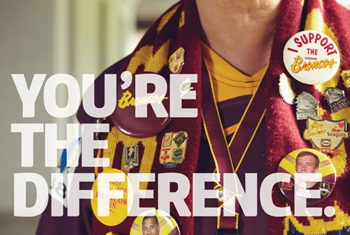
NRL
Membership
The value of an NRL membership includes designated seating, member-only activities, discounts and more – but highlighting rational benefits alone was no longer delivering desired membership growth. We had to generate greater emotional engagement, to encourage fans to become members. We reinforced the heightened sense of connection and support you feel as an NRL member. Being a member is the most emotionally connected way of supporting your NRL club and players. As a member you feel like you’re genuinely a part of your NRL team. ‘You’re the Difference’. An appeal directly to the passion of fans, to generate emotional fan engagement and translate it into action: becoming an NRL member.
integrated campaign | DESIGN DIRECTION
-
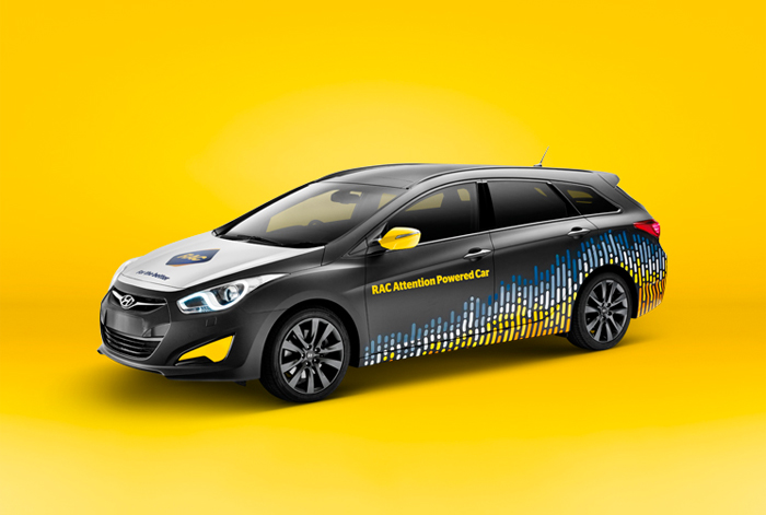
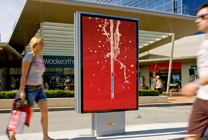
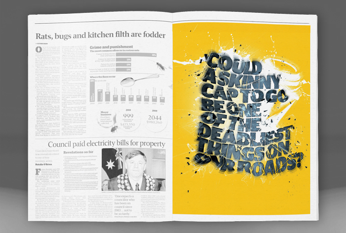
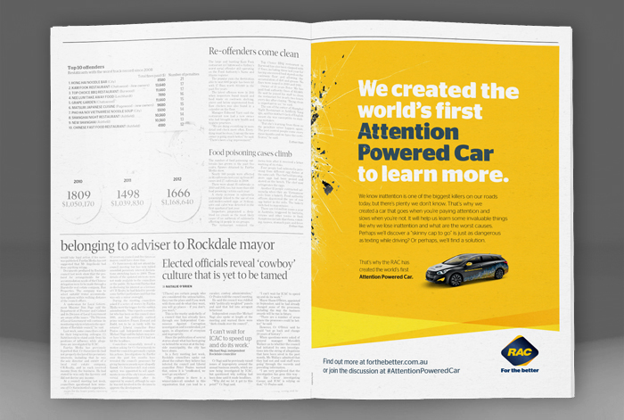
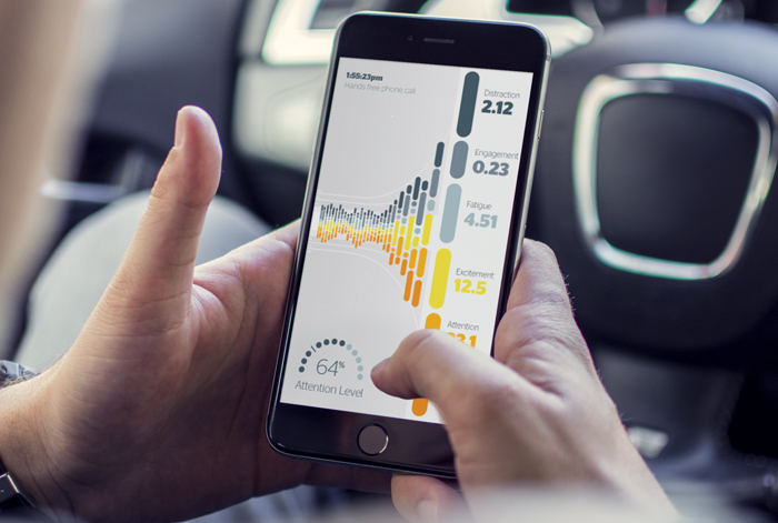
The Attention Powered Car
RAC
The attention powered car
A world-first idea with the power to save lives - the Attention Powered Car - was built to raise awareness of the deadly impact of inattention on our roads. Employing the use of neuro-technology, the Attention Powered Car goes when drivers are paying attention, and slows when they are not. The campaign has gained an unprecedented 55 million earned media impressions worldwide (29 million in Australia), across all continents except Antarctica.
integrated campaign | design
awards:
D&AD, Integrated & Earned Media, In-book 2014
One Show, IP & Products, Bronze Pencil 2014
AWARD, Creative Innovation, Bronze 2014
AdFest, Creative Innovation Lotus 2014
Campaign of the Year @ Campaign Brief WA Awards 2014
Cannes Lions, Integrated PR, Shortlist 2014
Clios, PR, Shortlist 2014
Spikes, Innovation, Shortlist 2014
Spikes, PR Integrated, Shortlist 2014
Mumbrella Award for Innovation 2014
Effies, 2 Silver 1 Bronze 2014
APAC Effies, 1 Bronze 2015
Asian Marketing Effectiveness, 1 Bronze 2015
-
UPDATERATOR
Mentos
>UPDATERATOR
How could we get a nation to update to Mentos NOWmints when Aussie pockets were already bulging with old mints? Introducing The Updaterator – a month-long national Facebook promotion that proved Mentos can make anything better – not just mints. We had over 1.6 million reach and over 500,000 interactions, increasing brand engagement 67% on the previous year. Plus we generated new social content daily that we used far beyond the promotional period!
social | design direction
-
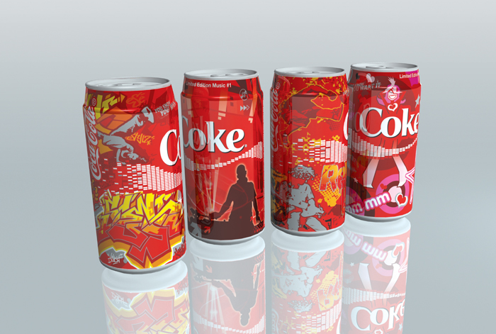
Limited edition music cans
Coca-Cola
Limited edition music cans
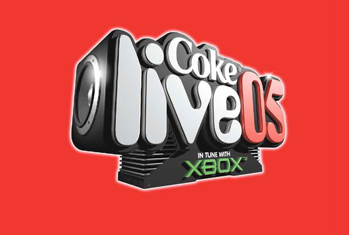
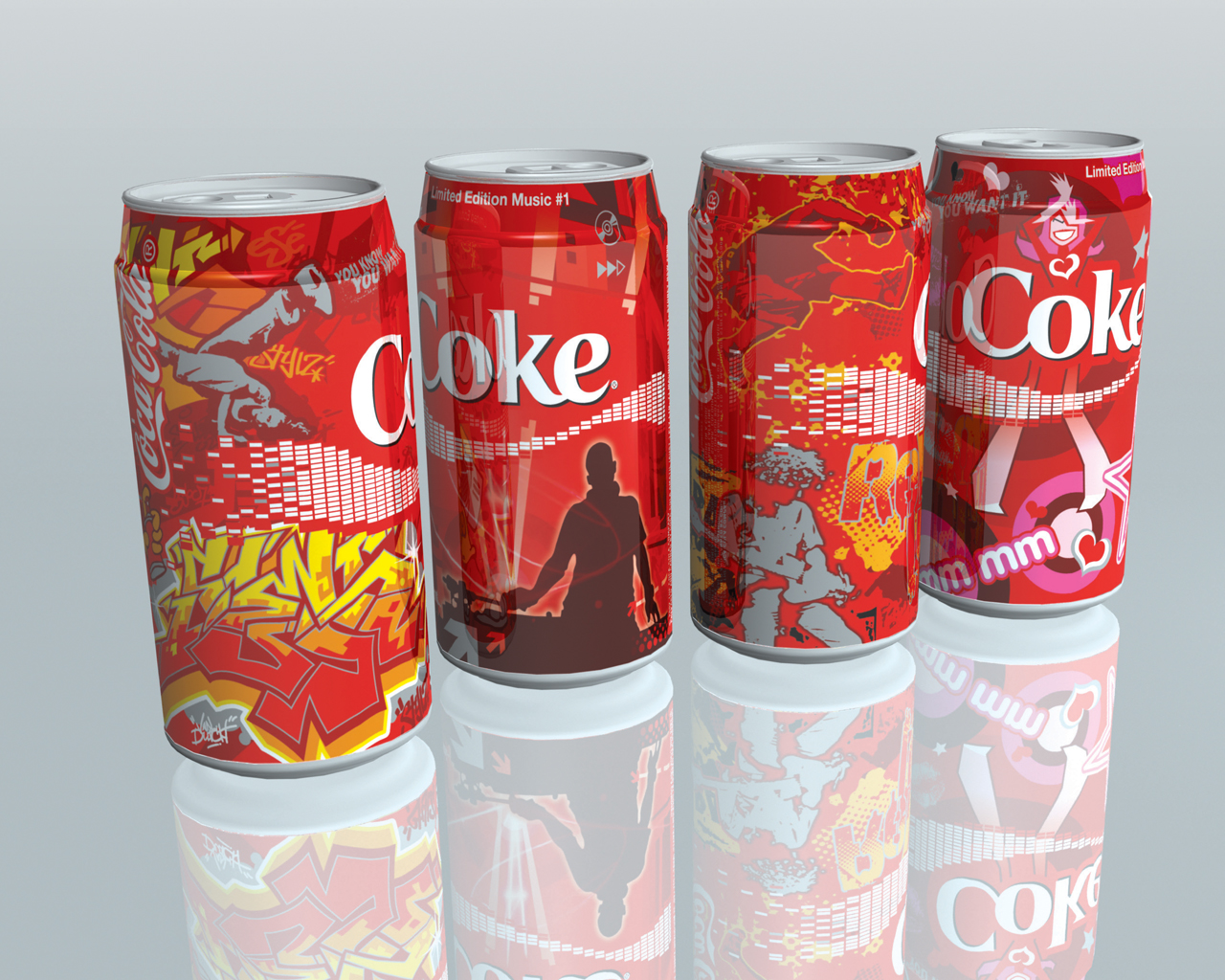
To connect with a younger audience Coca-Cola Amatil amped up their music sponsorship; it started branded first-off branded sponsorship of television chart shows and launched its own music festival, Coke Live '05, which aimed to bring some of the best home-grown talent to the living rooms and concert arenas of young Australians. To celebrate this Coca-Cola Amatil launched a limited edition range of 375ml cans with a distinct music-flavour each: Urban, Dance, Rock and Pop Music.
packaging | illustration
-

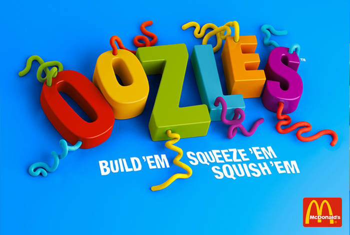
Oozles
McDonalds
-
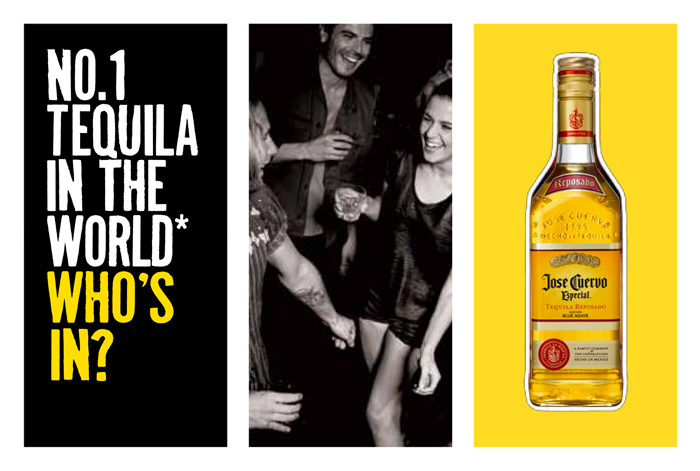
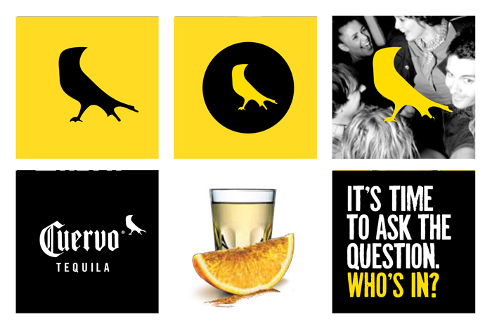
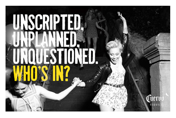
Who's In?
Cuervo
Who's In?
'There’s a question that comes before every round of tequila and it never refers to just the round. It’s a question that refers to the rest of the night, to the mindset of the people being asked and their willingness to let go and have fun. It’s a question that’s not really a question; it’s a challenge that you can’t say no to.'
Not having been marketed in Australia before, we launched a brand identity and a campaign for José Cuervo that was as fresh, bold and brash as the tequila itself.
brand id/campaign | design direction
awards:
Finalist APMA 2011 - Best Use of Creative in a Campaign
Silver APMA 2011 - Best Use of Direct Marketing
-

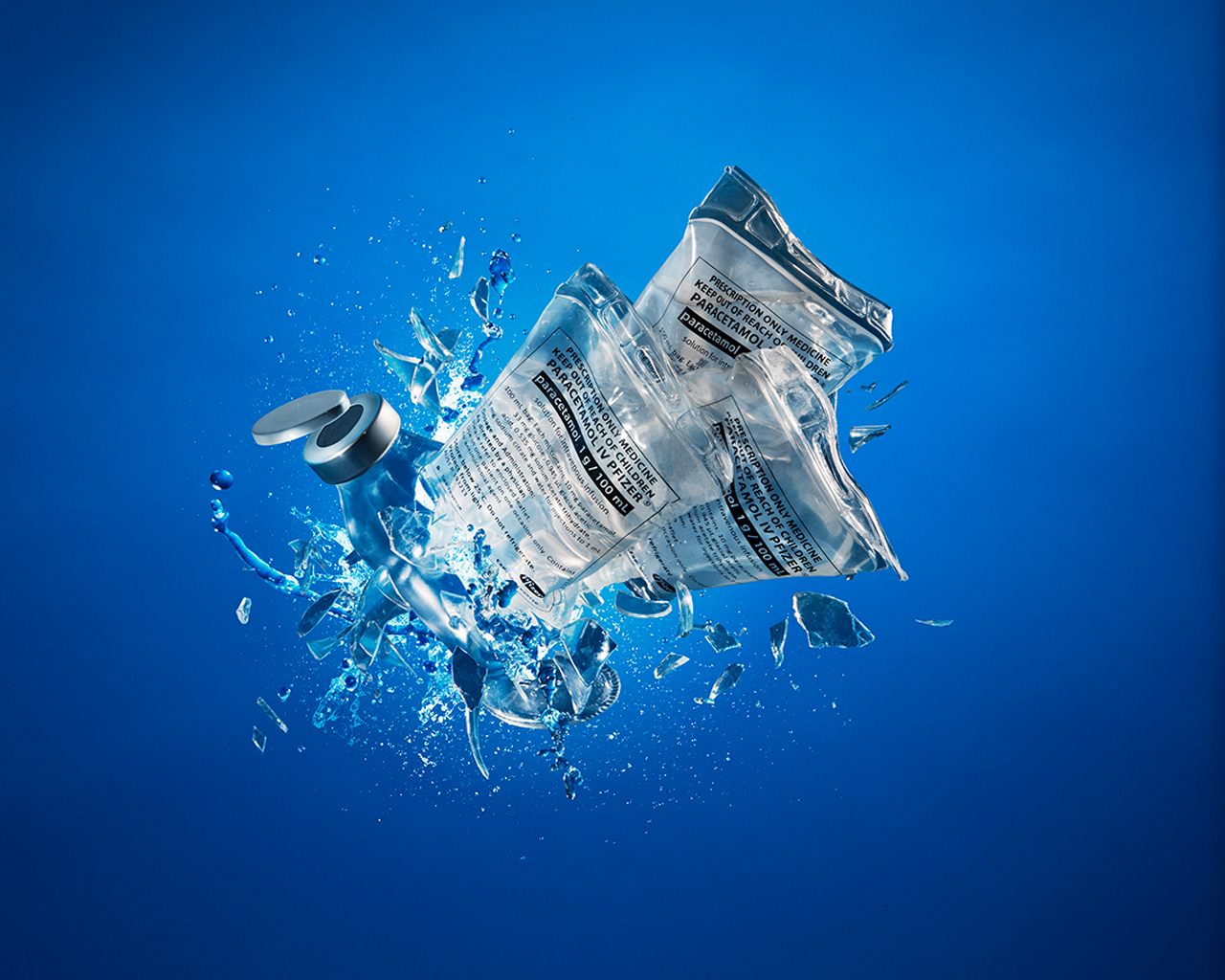
Paracetamol IV
Pfizer
-
State of Mind
NRL
state of Mind
Mental health issues affect 1 in 5 Australians, yet men are especially reluctant to seek treatment. They think asking for help is emasculating, and a sign of weakness.Leveraging the overt strength and masculinity of professional rugby league – coinciding with the code’s biggest matches, State of Origin – to encourage men to start conversations with one another. We took two of the games’ most physical players, who were involved in a famous in-game altercation in the previous State of Origin series, and encouraged them to just … chat. After all, if even Mylesy and Gall can talk it out then surely you can too?
Social/TV | design DIRECTION
awards:
AWARD 2015 Bronze - Film and Video
ACES 2015 Finalist - Best in Television & Cinema
-
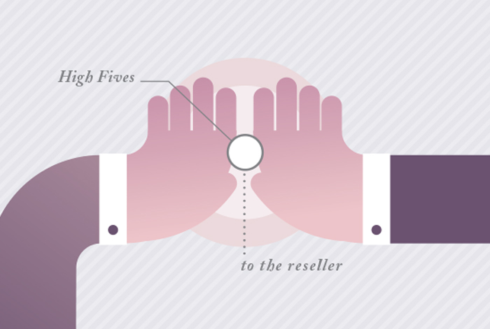
Laser Printers
Canon
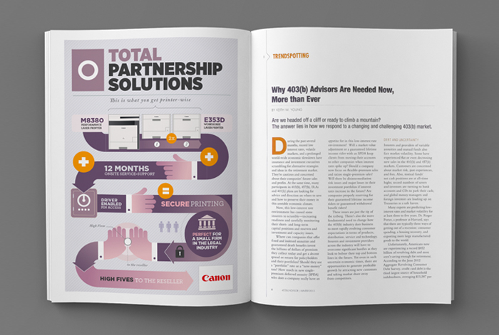
Laser Printers
The Canon Solutions Partner Program offers bespoke deals to specific branches of industry. To communicate these offers to resellers, which could be layered and quite specific, we took an infographic approach for it to be more engaging, easier to digest and, ultimately, more persuasive.
press | design DIRECTION
-
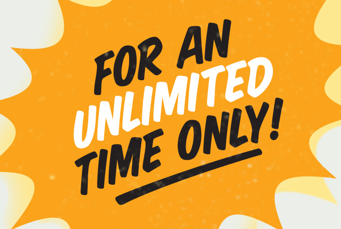
all year low prices
KTAS
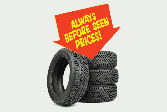
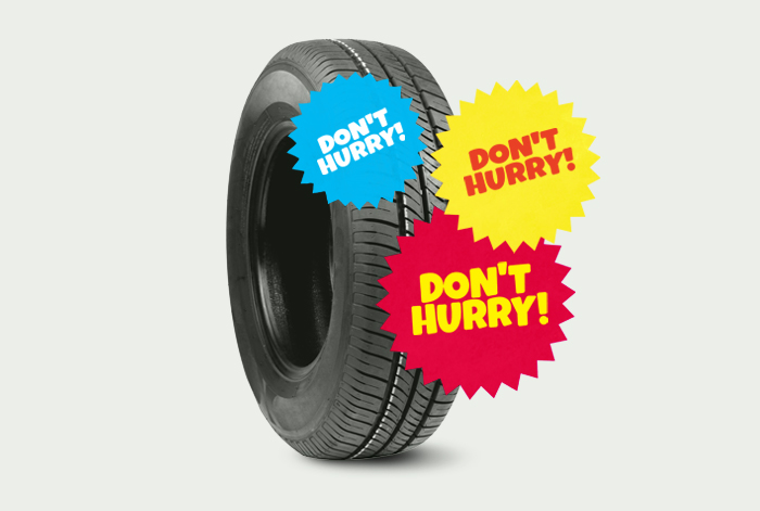
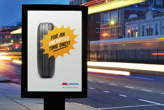
all year low prices
Value is an equation of price and quality. And K-Mart is already trusted with a minimum benchmark of quality in their retail business. So we chose to assure people on price: no need to hunt for a bargain, because K-Mart Tyre & Auto offers low prices all year round. With all-year low prices it’s like we’re always on sale. We took the ‘limited time’, ‘hurry’, ‘this offer can’t last’ iconography of the category and gave it an all-year round twist. The language and vocabulary of discounting and retail offers was hijacked and repurposed – across point of sale, print and outdoor.
INTEGRATED CAMPAIGN | DESIGN DIRECTION
-
Spring Racing Carnival
ATC
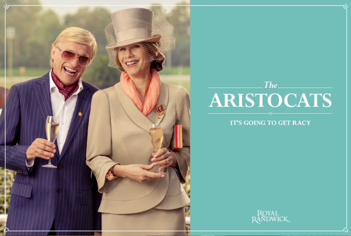
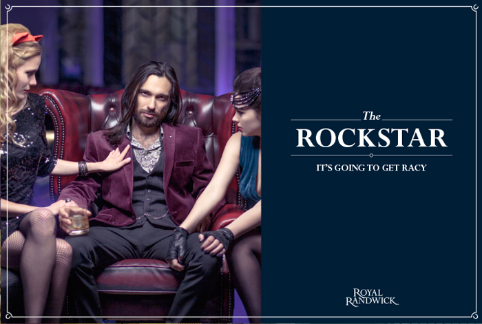
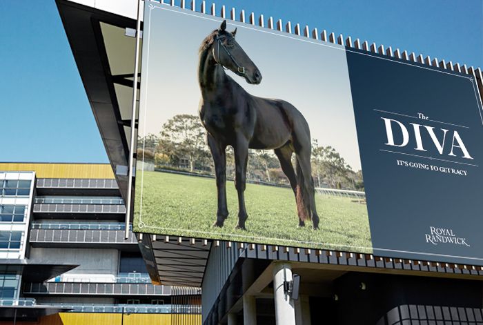
it's going to get racy
With race attendances in a 20-year decline, how do we get new and infrequent racegoers to reconsider heading to the Sydney races – amid a crowded sports calendar in which it’s Melbourne race meets dominate the landscape? We set out to significantly broaden the aspirational appeal of live racing, by revealing its wider-than-you’d-think audience that far outweighs the (sometimes seedy) racing stereotypes. We depicted the live experience of racing as akin to stepping into a playground of aspiration, exhilaration, and intriguing personas – with deliberate appeal to males and females, racegoers and non-racegoers alike. We created 13 distinct characters to represent the diverse live experience, all backed by the promise that “It’s Going to Get Racy”.
integrated campaign | DESIGN DIRECTION
-
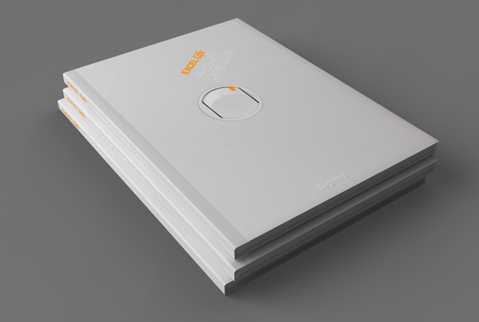
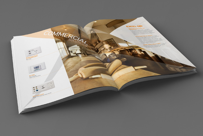
 It
Itexcel life
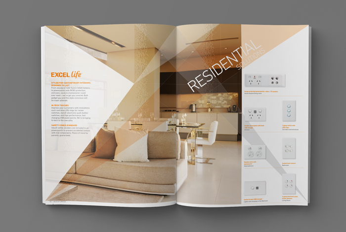
HPM Legrand
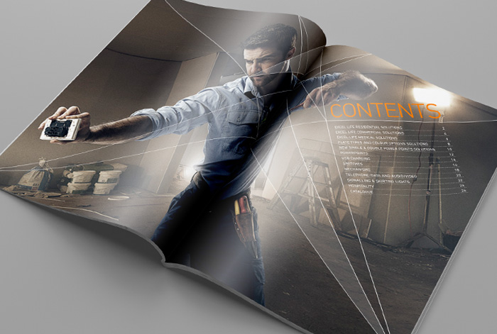
Excel Life
HPM LeGrand's Excel Life is a comprehensive range of switches and sockets for residential and commercial installations. It has more streamlined engineering and design that provides faster installation, better safety and sleeker end user design. To convince electricians to make the shift we created a catalogue for the relaunch of the product that focused on practical installation benefits, rather than relying on blokey gimmicry.
catalogue | design direction
-
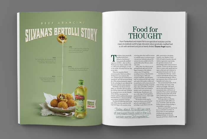
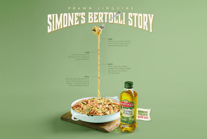
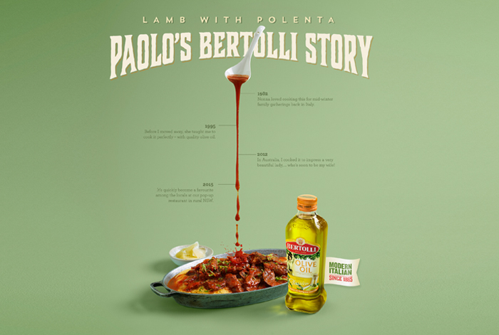
Italian Stories
Bertolli
italian stories
Bertolli Olive Oil has a rich and vibrant history, as do the many people of Italian origins who have made Australia their home. This campaign depicts the story of these people's family heritage, told through a traditional family recipe. In each case, the dish itself is styled and shot to act as a timeline for the family tale.
print/outdoor | design direction
-
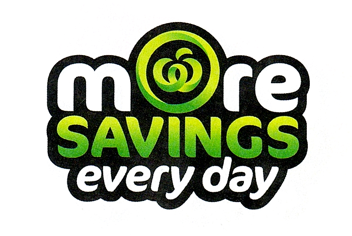
VALUE
Woolworths
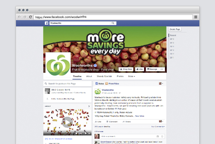
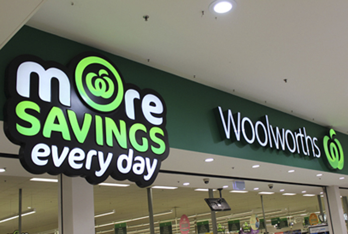
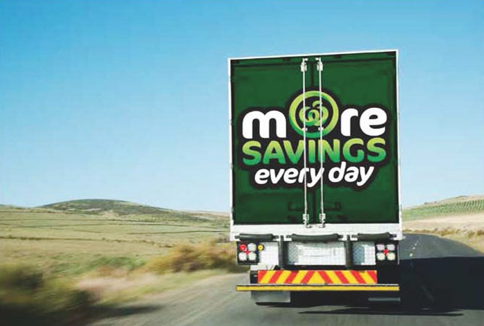
more savings every day
Even though figures showed the average shop at Woolworths was 2% cheaper than Coles, public perception suggested the opposite was true. Aggressive and consistent marketing from Coles had them winning the “value” war and this wasn’t going to change until Woolworths had a powerful and meaningful story of their own. We fought back with a bold promise – “More Savings Every Day” – and our bold new graphic language reached every part of the organization, from the signature on every store receipt to the back of Woolworths fleet of trucks. Four simple words, and the campaign that went with it, helped turn the tide. Prior to launch, Coles brand monitoring score for “value” had them five points ahead. In only three months Woolworths had drawn level and were on track to leave them behind.
retail identity | design
-
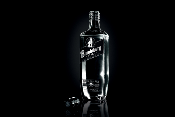
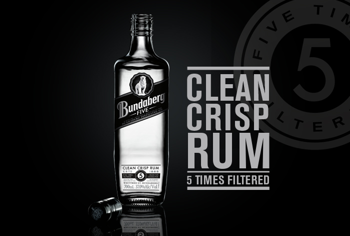
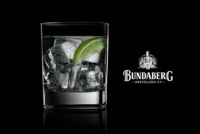
Bundy 5 launch
Bundaberg Rum
Bundy 5 launch
Most white spirits pride themselves on an absence of character. The norm is being bland and tasteless - they are clean and clear and pure - but they lack taste, character and are seen as easy to drink. In this bland and character-less world of white spirits, Bundy 5 was created to represent the taste and masculinity that's been missing in white spirits. To take on the bland world of white spirits. Bundy 5 successfully helped move and reposition the Bundy brand from a bear and his mates to a brand with now broader appeal across genders. Bundy now stands out with character, in the white spirit world dominated by blandness.
press/retail | art direction
-
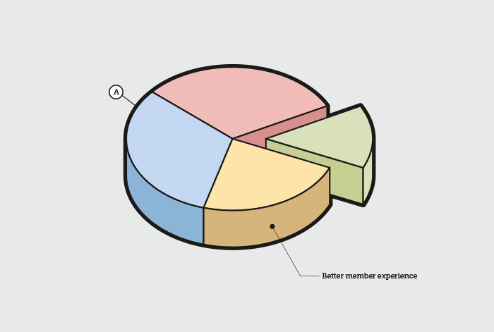
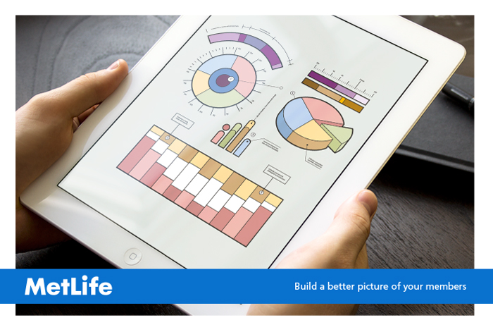
super fund dashboard
Metlife
Superfund dashboard
The world of industry superfunds is evolving and innovating quickly, and member engagement is a key priority for all superannuation partners. As part of their partnership program MetLife, one of the largest group of life insurers in Australia, launched a unique member engagement tool: the Fund Information Dashboard. A tool that promised to build a better picture of members. The infographic treatment was chosen to give a friendly face to the comprehensive portrait of individual members.
press | illustration
-
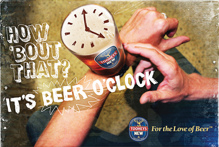
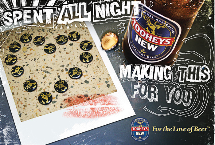
For the Love of Beer
Tooheys New
-
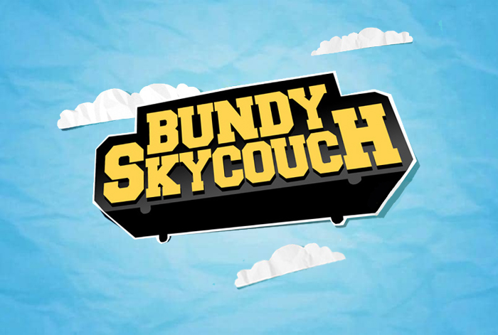
BUNDY SKYCOUCH
Bundaberg Rum
bundy skycouch
The Bundy Rum SkyCouch was Bundy's answer to the snobbery and exclusivity of the corporate SkyBox. An 8 seater couch that hung 140ft above a football stadium, complete with meat pies, Bundy Rum and your own personal cheerleaders. It united footy fans around the country and became Bundy's most successful promotion ever.
integrated campaign | design direction
awards:
Adfest 2011 Gold Lotus - Best Promo Event & Field
Adfest 2011 Gold Lotus - Best Promo Sponsorship Campaign
Cannes 2011 Finalist - Best Outdoor & Live Advertising
ADMA 2010 Bronze - Best Campaign
ADMA 2010 Bronze - Out Of Home
AWARD 2011 Finalist - Best Outdoor
AWARD 2011 Finalist - Best Promo
APMA 2011 Gold - Best Integrated Campaign
APMA 2011 Bronze - Best Brand Building Campaign
The Globes 2011 Order of Merit - Best B2B Campaign
-
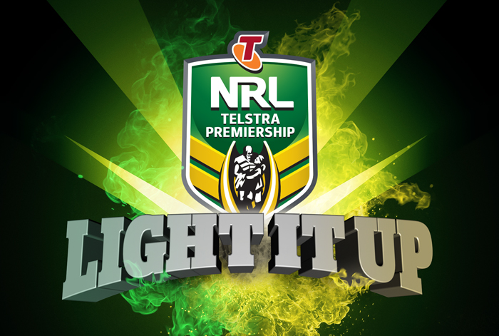
Finals Series
NRL
light it up
While the NRL Grand Final has always been popular, the rest of the finals series matches have not. The complex elimination system confuses casual fans, and avid fans can turn off once their team departs. We needed to heighten fan engagement and interest to drive game-day attendances – with a particular focus on the fickle Sydney market. For the very first time we positioned the NRL Finals as a stand-alone tournament. Where the stakes escalate, and teams, players and fans all step up to produce the unbelievable. We brightened interest and boosted crowds with an assurance of better football, more excitement and bigger entertainment. A time when the NRL ignites. We promised to LIGHT IT UP.
integrated campaign | DESIGN DIRECTION
-
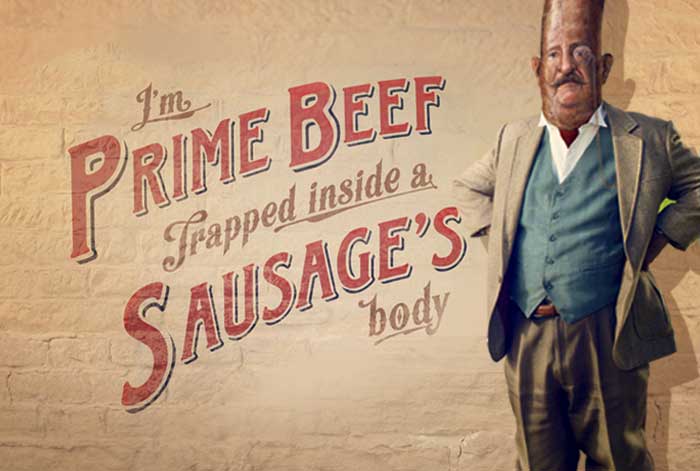
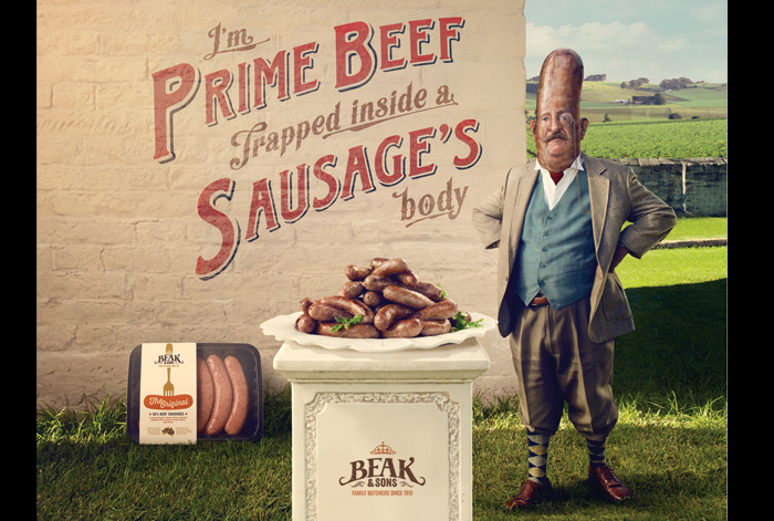
Not your common sausage
Beak & Sons
not your common sausage
We generated doubt about the quality of typical supermarket sausages by positioning the Beak & Sons brand as superior-made with the highest meat content of any sausage. And a Beak and Sons Sausage is not your average sausage. It is a superior form. We created a sausage character with an identity crisis, personifying the Beaks and Sons promise of butcher quality, 90% prime meat. He’s proud of his family name and butcher origins, but he will not tolerate being called a common sausage.
integrated campaign | DESIGN DIRECTION
-
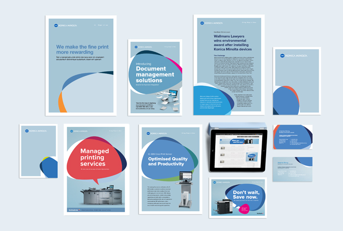
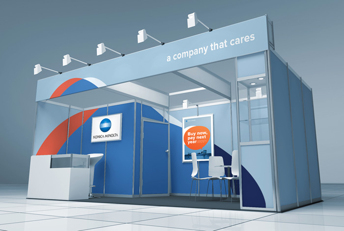
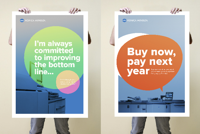
BRAND REFRESH
Konica Minolta
Brand Refresh
Throughout our new visual identity for Konica Minolta we’ve focused on creating a look and feel that reflects the brand’s key values - innovation, partnership, trust and customer care. We’ve developed a suite of design features and a palette of colours that are contemporary, flexible and approachable while also remaining true to the brand. Central to this brand refresh is the ‘Opal’, an organic form of overlapping shapes, created to give the brand an instantly recognisable, ownable motif that’s both eye catching and highly flexible. Organic shapes and soft hues have been used to create a sense of harmony and greater stand out.
BRAND IDENTITY | DESIGN DIRECTION
-
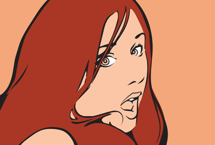
Illustration
various
-
identity
Various
-
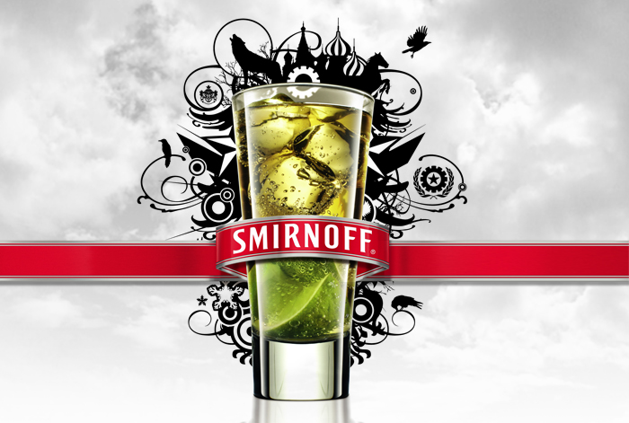
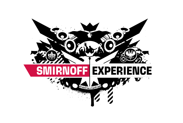
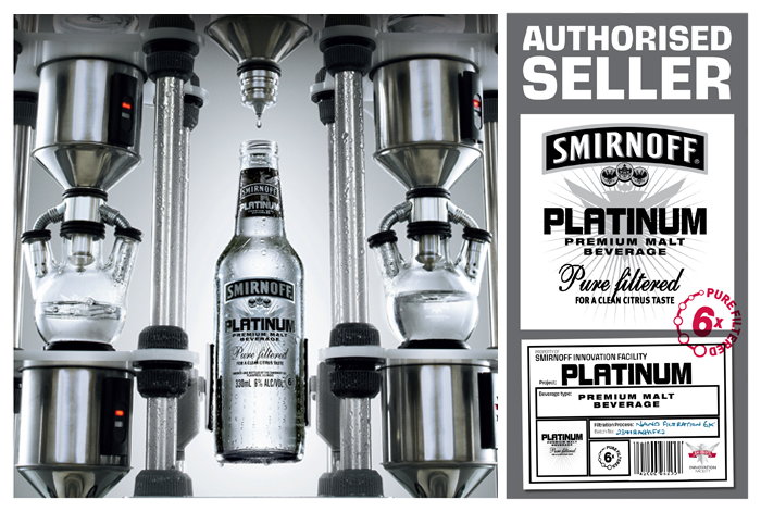
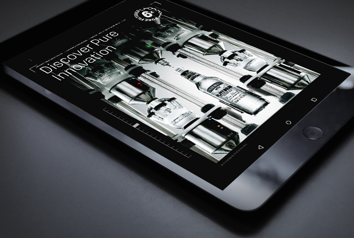
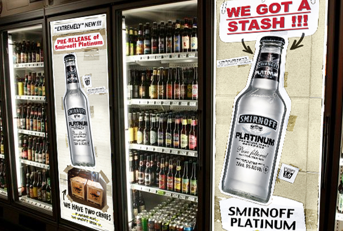
PLATINUM LAUNCH
Smirnoff
-
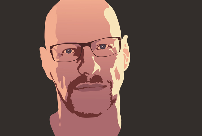
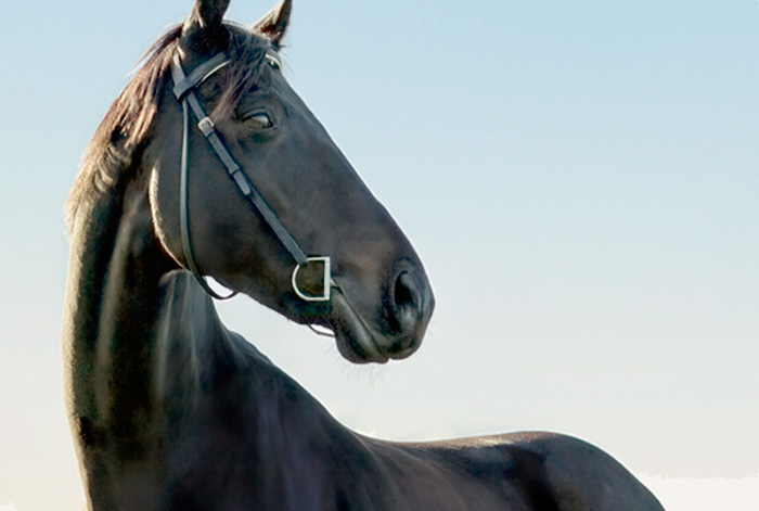
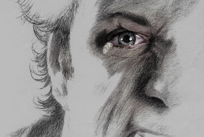
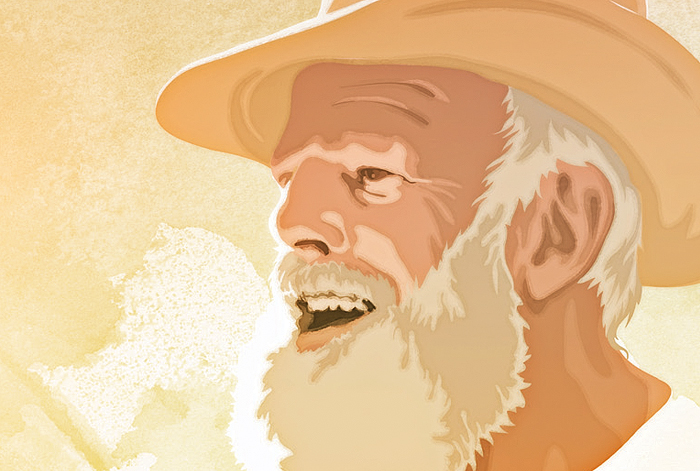
Portraits
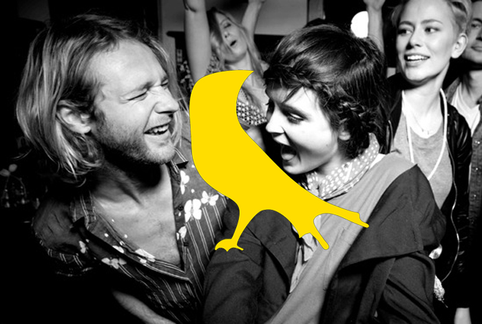
own work
PORTRAITS
I love doing portraits. It is always a two-way process. You don’t just document the subject and convey your perspective. You also involve yourself, your style and your relationship to the subject. It is also a little business I have on the side as ‘Mr Baart Does Art’.
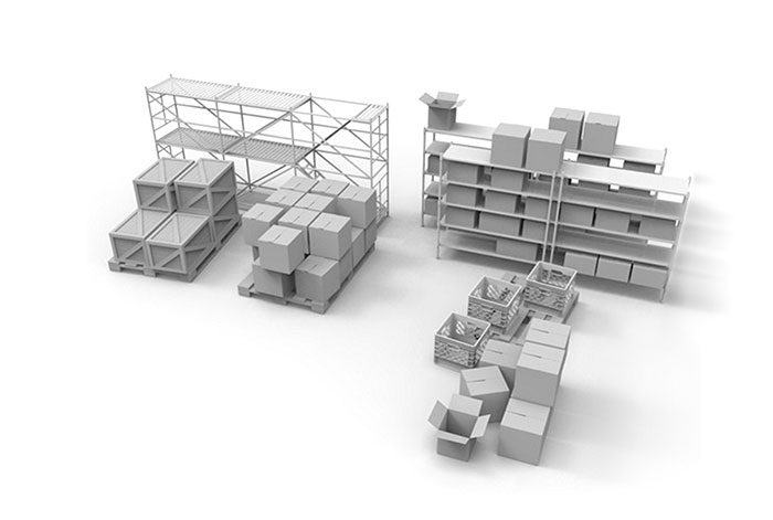
3D
various
3d work
I managed teach myself a little bit of Autodesk Maya, which has an insane learning curve. Apart from being a lot of fun, time and time again this has proven an invaluable tool for visualisations and presentations. Being able to see the work in-situ, especially in flythroughs, adds a whole new dimension [...].

